A single blood test result is a moment. Three results are a story. Anyone who looks at biomarkers only as individual values leaves the most important information on the table: direction. This guide shows you how to read biomarker charts so you can distinguish real trends from noise.
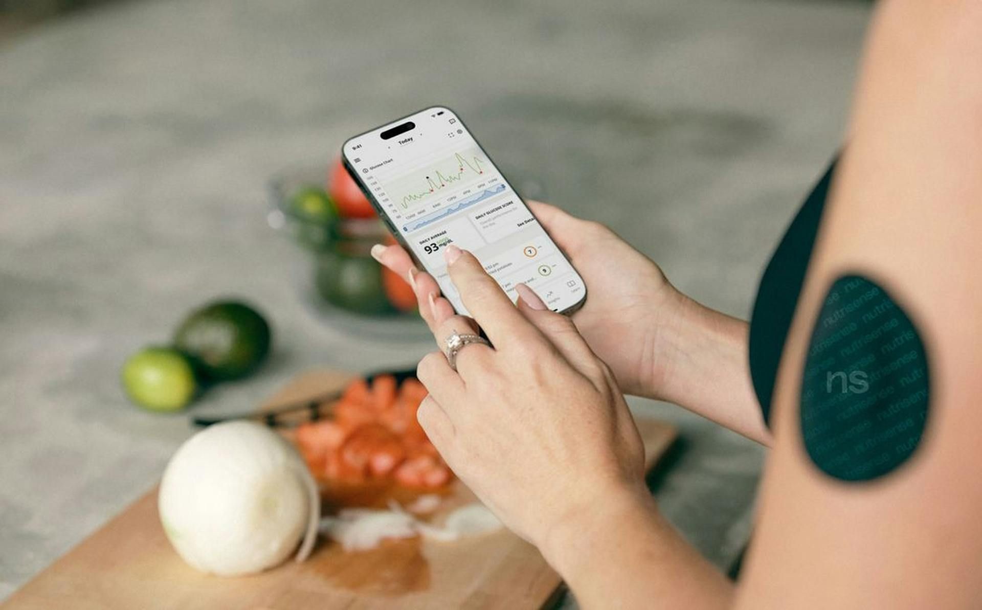
If you are not yet tracking your values systematically, the Lab2go features page shows what that looks like in practice. You can find plans and pricing there too at pricing.
What a Chart Shows You — and What It Does Not
A biomarker chart has several elements that together form a meaningful picture:
Y-axis — the measured value with its unit, for example ng/ml for vitamin D or U/L for liver enzymes. Without the unit, the number is meaningless.
X-axis — the date of the blood draw. The gaps between measurements are often irregular, and that is fine. What matters is the sequence of values over time.
Reference range as a grey band — the statistical norm from population data. 95 percent of people fall within it. Being inside the grey band does not mean you are at your optimal level.
Optimal range as a green band — defined functionally, often narrower than the reference range. Vitamin D between 40 and 60 ng/ml rather than just above 20 ng/ml. This band gives you a more meaningful target.
Trend line — shows the direction across multiple measurements. A falling trend line in haemoglobin across three measurements is a different signal from a single low point.
Context markers — annotations in the chart explaining why a value may have changed. For example: “started D3 supplementation (5000 IU/day)” placed above the date from which your vitamin D began rising.
Single Value vs. Trend: The Most Important Distinction
A vitamin D value of 32 ng/ml on its own is a weak statement. It sits within the reference range but below the functional optimum of 40 ng/ml. What now?
Look at the trend:
- Six months ago: 28 ng/ml, three months ago: 30 ng/ml, today: 32 ng/ml — upward trend. Your supplementation is working, even if you have not reached your target yet.
- Six months ago: 52 ng/ml, three months ago: 42 ng/ml, today: 32 ng/ml — downward trend. The dose is not enough. Talk to your doctor and adjust supplementation.
- Six months ago: 31 ng/ml, three months ago: 33 ng/ml, today: 32 ng/ml — stable trend. The current value is the normal setpoint for your current dose and sun exposure.
Three data points show a direction. One data point shows only a moment.
For more on building a solid measurement protocol, read the guide to long-term biomarker tracking.
4 Typical Trend Patterns and What They Mean
1. Stable Trend Within the Optimal Range
This is the goal. Your vitamin D has been between 48 and 55 ng/ml for two years. You take 5000 IU D3 daily and live in northern Germany. The dose fits. Nothing needs to change here.
A stable plateau at a target value is not stagnation — it is success. Do not over-interpret the small fluctuations between 48 and 55 ng/ml. That is normal biological noise.
2. Rise or Fall With a Clear Pattern
This pattern shows a response to an intervention. Classic examples:
- Vitamin D rises after starting D3 supplementation from 28 to 52 ng/ml over three months → the supplementation works
- Ferritin rises after 12 weeks of iron (100 mg/day) from 18 to 65 ng/ml → iron stores are filling up
- TSH falls after starting thyroid therapy → the treatment is taking effect
- LDL falls after switching to a Mediterranean diet from 145 to 112 mg/dl over six months → dietary change is working
The context marker is critical here. Without it, you do not know what triggered the trend.
3. Outlier / Spike
A single value jumps sharply up or down, then the next measurement returns to baseline. That is not a trend — that is noise.
Common causes of outliers:
| Marker | Typical outlier cause |
|---|---|
| TSH | Biotin supplementation above 5 mg/day |
| AST (GOT) | Strength training in the past 48 hours |
| CRP | Infection, dental procedure, intense workout |
| Ferritin | Acute infection (ferritin is an acute-phase protein) |
| Many markers | Dehydration on the day of the blood draw |
| Women: oestrogen, LH | Cycle phase |
Rule: Do not over-interpret an outlier. Check context. Re-test in four to six weeks. Only if the second result is also abnormal does a real trend exist.
4. Unexpected Downward Trend
This is the pattern that calls for action. Three measurements show a continuous decline in a marker that should be stable:
- Haemoglobin: 14.2 → 13.1 → 12.3 g/dl over six months with no change in diet → investigation needed (iron deficiency, chronic inflammation, bleeding source?)
- eGFR: 82 → 74 → 68 ml/min/1.73m² over one year → check kidney function
- Testosterone: 580 → 490 → 410 ng/dl over 18 months → look for causes (sleep, stress, body weight, hormonal shift)
An unexpected downward trend does not automatically mean disease. But it is a signal you should not ignore. Start with context analysis: what changed during that period?
Time Dimension: How Fast Do Biomarkers Respond?
Not all markers respond at the same speed. The timing of your measurements needs to match the marker:
| Time window | Markers that respond here |
|---|---|
| Short-term (days to weeks) | CRP, fasting glucose, white blood cells, urea |
| Medium-term (3–6 months) | Ferritin, vitamin D, HbA1c, LDL, HDL, triglycerides |
| Long-term (1–5 years) | eGFR, haemoglobin, testosterone, DHEA-S, longevity markers |
Practical consequence: If you re-test ferritin after four weeks of iron supplementation and are disappointed by the small change, you are measuring too early. Ferritin needs 8–12 weeks for a visible rise. If you expect HbA1c to fall after two weeks of low-carb eating, you will get a misleading picture — HbA1c reflects three months of average blood glucose.
For more on which markers to test and when, read the guide to designing biomarker panels.
Documenting Context: The Key to Understanding Charts
The most common mistake when reading charts is missing context. A value without context is like a GPS coordinate without a map.
Document at every blood draw:
Timing and preparation
- Time of day of the draw (hormones like cortisol and testosterone have diurnal variation)
- Fasting or not (affects glucose, insulin, triglycerides, GGT)
Physical activity
- Exercise in the past 48 hours (raises AST, CK, ferritin, sometimes CRP)
- Training phase: building, maintenance, deload
Supplements and medications
- Which supplements, dose, how long
- Prescription medications (statins affect lipids, metformin affects B12)
Health status
- Infections in the past four weeks (affect CRP, ferritin, white blood cells)
- Chronic conditions or acute events
Women: cycle phase
- Oestrogen, LH and FSH fluctuate strongly across the cycle
- Always measure in the same cycle phase for comparability
Alcohol
- Consumption in the past 72 hours (affects GGT, triglycerides, sleep quality)
A concrete example: your GGT has risen from 38 to 72 U/L. Without context, that is alarming. With context — you attended wine tastings three times last week — the explanation is clear.
For a structured approach to the tracking protocol, read the guide to understanding blood values.
Reading Correlations Between Markers
Biomarkers do not stand alone. These pairs and clusters are especially informative:
Thyroid: TSH behaves inversely to fT3 and fT4. When thyroid hormones rise, TSH falls — that is the feedback loop of the hypothalamic-pituitary axis. If TSH falls but fT3 and fT4 stay normal, check external factors first (biotin, stress, sleep deprivation).
Insulin and blood glucose: HbA1c and fasting insulin both rise with insulin resistance, but not in sync. Fasting insulin above 10 mU/L with still-normal HbA1c (below 5.7 %) is an early warning sign for metabolic dysfunction.
Iron and inflammation: Ferritin is an acute-phase protein. A ferritin of 120 ng/ml can mean full iron stores — or an inflammatory response. Always look at CRP at the same time. If CRP is elevated, ferritin is unreliable as an iron marker.
Vitamin D and PTH: Parathyroid hormone (PTH) rises when vitamin D falls — inverse correlation. Normal PTH alongside low vitamin D is reassuring. Elevated PTH with low vitamin D indicates secondary hyperparathyroidism.
Fatty liver cluster: Elevated ALT, elevated GGT and elevated triglycerides together are a typical pattern for non-alcoholic fatty liver disease. A single elevated marker says little. The cluster says a lot.
For more on interpreting reference ranges and optimal target values, read the guide to reference ranges vs. optimal values.
Cross-Marker Visualisation: Reading Lifestyle and Lab Together
The most powerful analysis comes from combining lifestyle data with laboratory values. Conceptually:
Fasting and lipid profile: Your LDL fell from 145 to 112 mg/dl over six months. What happened at the same time? You switched to 16:8 intermittent fasting. Combining the trend chart with a context marker makes the connection visible.
Sleep and inflammation: You track your sleep quality with a wearable. Your CRP rose to 3.2 mg/L at the last measurement. Your average sleep duration over the past six weeks was under six hours. Poor sleep and elevated systemic inflammation — a well-documented connection.
D3 start and vitamin D rise: You started 5000 IU D3 daily on 1 January. Three months later your vitamin D rose from 24 to 48 ng/ml. That is the proof that supplementation works for you at that dose.
For designing your own N=1 experiments along these lines, read the guide to N=1 self-experiments.
Common Reading Mistakes
Comparing a single value to the last value. Two points do not make a trend. The jump from 32 to 38 ng/ml of vitamin D could be measurement noise — or a real response. Only the third point clarifies that.
Looking only at LDL and ignoring ApoB. LDL cholesterol can rise due to more LDL particles or larger particles. ApoB (apolipoprotein B) counts the particles directly. Two people with LDL 130 mg/dl can have very different ApoB values — and therefore very different cardiovascular risk.
Comparing absolute values instead of percentage changes. Ferritin from 18 to 65 ng/ml is a rise of 261 %. Ferritin from 90 to 92 ng/ml is noise. Looking only at absolute numbers obscures the difference.
Switching labs without noting it. Different laboratories have different reference ranges and measurement methods. If you move from lab A to lab B and your TSH suddenly looks different, that may reflect the method, not your thyroid.
Confusing “normal” with “optimal.” The reference range tells you that you are not ill. It does not tell you that you are at your optimal level. A ferritin of 18 ng/ml is “within the normal range” — but it is too low for endurance performance or optimal cognitive function. More on this in the guide to reference ranges vs. optimal values.
Practical Workflow: Quarterly Chart Review
A structured review takes 15 minutes and gives you more clarity than hours of research:
Step 1: Open all charts and get a quick overview. Which markers have changed since the last review?
Step 2: Identify trends. Is something rising that should be stable? Is something falling that should be rising? Are there outliers?
Step 3: Add context. What changed during the observation period? New supplements, dietary changes, training phase, period of high stress, infection?
Step 4: Formulate a hypothesis. “The rise in my GGT to 68 U/L correlates with the holiday season and increased alcohol consumption in December.”
Step 5: Plan an intervention or re-test. If the hypothesis is plausible, change the variable and re-test in 8–12 weeks. If the trend is unclear or concerning, discuss it with your doctor.
For how to implement this workflow in practice, see the Lab2go tutorial for blood value tracking.
Conclusion: Trends Always Beat Single Values
A biomarker chart is not a diagnostic tool — it is a navigation instrument. It shows you which direction you are heading, not exactly where you will land.
The key principles:
- Three data points minimum for a trend statement
- Document context at every measurement
- Do not over-interpret outliers — re-test
- Read correlations between markers, not just individual values
- Consciously distinguish “normal” from “optimal”
- Schedule 15 minutes quarterly for the chart review
For the full framework for systematic biomarker management, read the guide to long-term biomarker tracking. And if you do not yet have access to your own lab values over time, take a look at the Lab2go features.
This article does not replace medical advice. Unexpected trends in important markers — falling eGFR, declining haemoglobin, sharply elevated CRP — should always be discussed with a doctor.
Article FAQ
- How many data points do I need to identify a trend?
- Three data points are the minimum for a meaningful trend statement. A single value only shows the status at one specific moment — it says nothing about direction. Two values give you a line, but not yet a pattern. From three measurements onward you can tell whether something is rising, falling or staying stable. For slowly changing markers like vitamin D or ferritin, four to five measurements over 12 months give a clearer picture.
- What is the difference between a reference range and an optimal range?
- The reference range defines what is statistically normal for 95 percent of the population — it is a statistical construct, not a functional optimum. Vitamin D above 20 ng/ml is considered sufficient, but many experts consider 40–60 ng/ml the functional optimum. Ferritin above 15 ng/ml is within the reference range, but endurance athletes often need 70–100 ng/ml for optimal erythropoiesis. A chart with both bands — grey for the reference range, green for the optimal range — shows you immediately which zone you are in.
- What are typical causes of outliers in biomarker charts?
- Outliers are usually caused by context factors, not real health changes. Biotin supplements above 5 mg per day can distort TSH and thyroid hormone readings. Intense exercise within 48 hours before blood draw raises AST, CK and sometimes ferritin. Dehydration increases many concentration-based values. An infection in the past four weeks drives up CRP, ferritin and white blood cells. Always document context before interpreting an outlier.
- How long does it take for ferritin to respond to iron supplementation?
- Ferritin responds slowly to iron supplementation. After four weeks of 100 mg elemental iron per day, ferritin typically rises by 10–20 ng/ml. After 8–12 weeks the increase should be clearly visible. If ferritin has not risen after 12 weeks, check: is the iron taken correctly (fasting or with vitamin C), is there a malabsorption issue, or are you losing iron faster than you can absorb it?
- Can I directly compare biomarker values from different laboratories?
- No, direct comparisons between laboratories are unreliable. Different labs use different measurement methods, reagents and reference ranges. TSH measured with Roche Elecsys gives different absolute values than an immunometric method from another manufacturer. For trend analysis, always use the same laboratory where possible. If you switch labs, note that as a context marker in your chart.
- What does it mean if TSH falls but fT3 and fT4 stay normal?
- An isolated low TSH with normal fT3 and fT4 can indicate subclinical hyperthyroidism, but it is also often an outlier caused by external factors such as acute stress, biotin supplementation or sleep deprivation. The classic thyroid feedback mechanism is inverse: when fT3 and fT4 rise, TSH falls. If both hormones stay normal but TSH is low, a repeat measurement after four to six weeks is more useful than immediate action.
- How do HbA1c and fasting insulin correlate?
- Both markers rise with insulin resistance, but not in sync. HbA1c above 5.7 % combined with fasting insulin above 10 mU/L points to early insulin resistance long before HbA1c reaches the diabetes threshold of 6.5 %. HbA1c reflects average blood glucose over the past three months. Fasting insulin responds faster to lifestyle changes. Tracking both in the same chart gives you a more complete picture than either marker alone.
- How often should I review my biomarker charts?
- A quarterly review is sufficient for most markers. Schedule 15 minutes, go through all charts and flag trends that need attention. During active interventions — a new supplement or dietary change — a monthly check can be useful. After a re-test, compare the new value with the previous one immediately to assess the effect of the intervention.
- What is a context marker in a biomarker chart?
- A context marker is an annotation in the chart that explains why a value may have changed. Examples: 'started D3 supplementation (5000 IU/day)', 'flu infection', '6-week carbohydrate reduction started', 'doubled training volume'. Without context markers, a ferritin rise to 85 ng/ml after an infection looks identical to a genuine rise from iron supplementation.
- Which biomarkers respond fastest to lifestyle changes?
- CRP responds within days to acute inflammation or its resolution. Fasting glucose and insulin show a measurable response after two to four weeks of dietary changes. Triglycerides and HDL respond after four to eight weeks of nutritional changes. Ferritin, vitamin D, HbA1c and thyroid markers need three to six months for a clear trend statement. Testosterone and DHEA-S respond over several months to changes in sleep, training and stress reduction.
This article is for general information only and is not a substitute for individual medical advice, diagnosis, or treatment. Discuss any changes to your diet, supplementation, or medication with a qualified healthcare professional.

Maritta Schmid, Founder lab2go, Biohacker
Founder & Biohacker
Berlin, Germany
Connects health data, technology, and practical routines for real behavioral change.
Areas of focus
Discussion
Community comments coming soon. Until then, we welcome feedback and questions via email.
E-Mail anzeigen