TL;DR: Build a 3-layer health analytics stack (Capture, Model, View) to transform scattered CSVs and PDFs into one actionable dashboard. Use sparklines for biomarker trends, stacked bars for supplement compliance, and automated alerts for deviations.
In my own tracking I noticed: I had been collecting data for years without ever actually using it. Lab values in one app, HRV in another, supplement log in a note, and reports as photos in the cloud. The moment everything clicked was when I tried to answer a simple question for the first time: “Did my vitamin D protocol last winter stabilize my HRV baseline?” It took four hours to pull together data from three different sources. Suddenly it was clear: the problem was not the volume of data — it was the missing architecture. Three layers, built consistently, brought the answer to the same question down to 10 minutes.
Architecture in Three Layers
Your health data likely lives in 5 or more places right now: wearable apps, lab portals, email attachments, supplement bottles, and handwritten notes. A structured analytics blueprint consolidates everything into three layers.
- Capture – API sync (Oura, Garmin, Levels), lab uploads, and supplement logs flow into one inbox. With Lab2go’s features, you can import lab PDFs and wearable data directly.
- Model – Normalization on a unified timeline, mapping per biomarker and supplement. Every data point gets a timestamp, source tag, and confidence level.
- View – Widgets for goal achievement, trends, and alerts. Your connected health dashboard becomes the single source of truth.
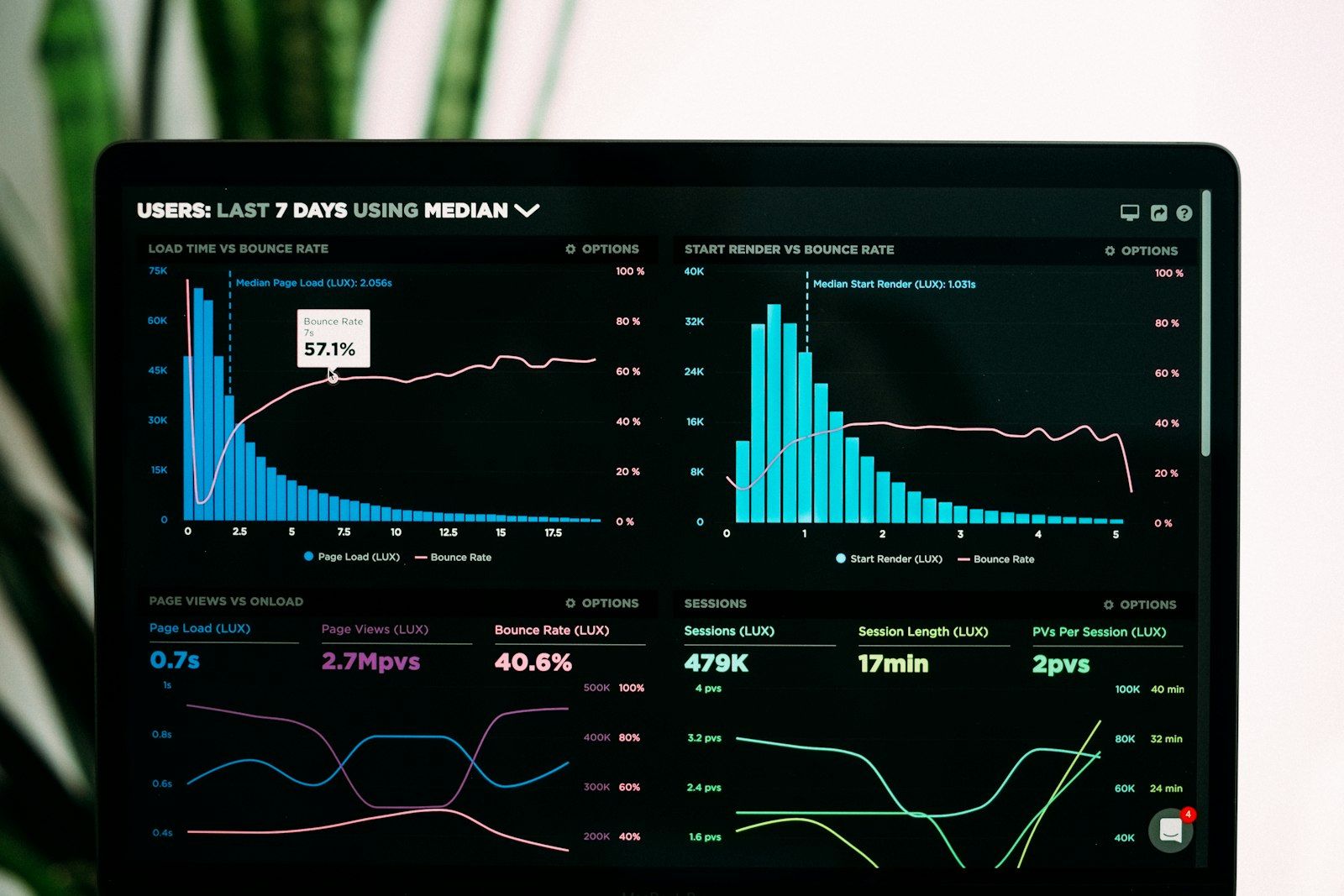
Which Charts Work
Not every visualization suits health data. Here are the proven formats:
- Sparkline + Target Range for biomarkers (ferritin, hsCRP). You see the trend and your personal corridor at a glance.
- Stacked Bars for supplement compliance. Track whether you hit your daily targets across all products.
- Correlation Cards (e.g., sleep vs. fasting blood sugar). These reveal cause-and-effect patterns that single-metric charts miss.
For deeper chart design, consider pairing your analytics layer with a cyclic routine playbook so your visualizations align with your training and supplement phases.
Alert Logic
Alerts are what turn a passive dashboard into an active decision tool. Set rules for three key scenarios:
| Trigger | Rule | Action |
|---|---|---|
| Biomarker outside target corridor | value > targetHigh or < targetLow | Reminder + doctor info |
| Supplement missed | 3x in a row | Push to phone |
| Insight ready | Trend stable > 21 days | Insight card to user |
Your alert thresholds should be based on your personal biomarker baseline, not generic reference ranges. This prevents false positives and keeps notifications meaningful.
Implementation
- Use transform scripts to harmonize units across labs, wearables, and self-reports. A value in nmol/L from one lab and ng/mL from another must be converted before comparison.
- Store each insight with a link to its underlying dataset so decisions are traceable. This is the same principle behind long-term biomarker tracking: every conclusion needs a data trail.
- Start with 3 to 5 core biomarkers rather than tracking everything at once. Add metrics only when you have a clear hypothesis to test.
From Blueprint to Daily Routine
The blueprint is only valuable if it feeds into your daily workflow. Consider these steps:
- Connect your analytics stack to your supplement iteration framework so every product change triggers a measurement checkpoint.
- Use wearable data quality filters before data enters your dashboard. Clean inputs produce reliable insights.
- Explore Lab2go’s pricing plans to find the tier that matches your data volume and sharing needs.
My self-tracking experiment: I wanted to understand which input drives my hsCRP most — sleep, training, or nutrition. Starting point: hsCRP 1.9 mg/L, HRV baseline 38 ms (Oura), average sleep quality 68 out of 100, three strength training sessions per week. I built a simple blueprint: biomarkers quarterly, wearable daily, supplement log daily. After 8 weeks of sleep optimization (target 7.5 hours, consistent bedtime), HRV rose to 44 ms — and hsCRP fell to 1.2 mg/L at the next measurement. Interesting: increasing omega-3 from 2 g to 3 g EPA+DHA during the same period produced no additional visible effect by comparison. What I learned: for my phenotype, sleep duration is the strongest inflammation modulator — not the supplement dose. Without a connected capture layer, I would never have isolated that finding.
Conclusion
A clear analytics blueprint transforms loose CSVs into a decision center. You spot bottlenecks faster, prioritize interventions, and build a documented health journey. The three-layer architecture (Capture, Model, View) scales from 3 biomarkers to 30 without losing clarity.
Article FAQ
- What is a health analytics blueprint?
- A health analytics blueprint is a structured plan for collecting, normalizing, and visualizing your biomarker, wearable, and supplement data in one unified system. It typically includes three layers: data capture, data modeling, and a visual dashboard. The goal is to turn scattered CSV files and PDF reports into actionable insights that drive health decisions.
- How do I build a biomarker dashboard from scratch?
- Start by connecting your data sources such as wearables, lab portals, and supplement logs into a single capture layer. Then normalize units and timestamps so all data sits on one timeline. Finally, build a visual layer with sparklines for trends, stacked bars for compliance, and correlation cards for cross-metric analysis. Most users see usable results within 2 weeks.
- Which chart types work best for health data?
- Sparklines with target range overlays work best for biomarkers like ferritin and hsCRP because they show trends at a glance. Stacked bar charts are ideal for supplement compliance tracking. Correlation cards that compare two metrics, such as sleep quality versus fasting blood sugar, help you spot cause-and-effect patterns across your data.
- How often should I review my health analytics dashboard?
- Review your dashboard at least once per week for a quick status check. Schedule a deeper 30-minute review monthly to update hypotheses, adjust supplement protocols, and validate alert thresholds. Quarterly reviews should include a full audit of your KPI targets and data sources to ensure everything remains relevant.
- What alert rules should I set for biomarker tracking?
- Set alerts for three scenarios: when a biomarker leaves your personal target corridor, when you miss a supplement three or more times consecutively, and when a trend stabilizes for 21 or more days indicating a new baseline. Each alert should include a clear action step such as consulting your doctor or adjusting a supplement dose.
- Why is data normalization important for health analytics?
- Different labs, wearables, and tests use different units, reference ranges, and sampling frequencies. Without normalization, you cannot compare a vitamin D reading from Lab A with one from Lab B, or overlay HRV data from your watch with cortisol values from a blood test. Normalization puts everything on a unified timeline with consistent units so trend analysis becomes reliable.
- How do I connect wearable data with lab results?
- Use a shared timestamp and context layer to align wearable data with lab results. For example, tag your Oura HRV data and your hsCRP lab result with the same date and context note like 'marathon prep week.' This lets you build correlation cards that reveal relationships such as declining HRV paired with rising inflammation markers, which guides your next intervention.
- What tools do I need for a personal health data stack?
- At minimum you need a data capture tool for imports, a normalization layer for unit conversion, and a visualization frontend. Lab2go handles all three in one app. If you prefer a custom setup, combine a spreadsheet or database for storage, a transform script for normalization, and a charting tool for dashboards. The key is that all layers share one unified data model.
This article is for general information only and is not a substitute for individual medical advice, diagnosis, or treatment. Discuss any changes to your diet, supplementation, or medication with a qualified healthcare professional.

Maritta Schmid, Founder lab2go, Biohacker
Founder & Biohacker
Berlin, Germany
Connects health data, technology, and practical routines for real behavioral change.
Areas of focus
Discussion
Community comments coming soon. Until then, we welcome feedback and questions via email.
E-Mail anzeigen